When we create a website for a client, we always follow the same steps because it’s the best way to work.
- Create the home in the main language and define the ultimate sections
- Create the whole website in the main language
- Translate the website to the other languages
- Prepare y start the booking engine
- Publish the website online
Step one: The creation of the home in the main language
Before we start, we decide what template we’re going to use. Although we have the themes uploaded on CloudHotelier, we are always creating new themes, so if you can’t find anything that catches your eye, just write to us and we’ll show you what we’re working on.
When choosing a template, is important to know what type of hotel do you have and what are your preferences. It at the beginning you’re still not sure, don’t worry! While developing the home you’ll start to have a clearer image of what you want. In this step, it’s important that you provide us with photographs and the logo of your hotel so we can define the colours and typographies and start your website.
Usually, our Homes are formed with these sections:
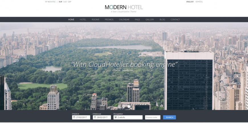
1. Main slider of pictures, it can be texts or not, it depends on every hotel. The objective is to impact the visitor like they were looking at an advert in a magazine. We look for the reaction: “wow, this is promising”.
2. Welcome: This is a short description of the hotel. The objective is to gain proximity to the visitor and that they keep navigation through your website. We look for the reaction: “yes, this is what I was looking for”.
3. Featured: These are the things that make your website different, through the pictures we connect your website with articles about your hotel, for example, which activities does your hotel provide, does is have a pool, a sauna? Through this section, we get the reaction: “yes, this is interesting”
4. Reviews from clients: We need affinity and empathy with the visitor, we need them to see themselves reflected in our reviews. We usually look for comments from booking.com which is the one the clients value more and we add it to the reviews section. We look for pictures that identify the typical client of your hotel. The reaction we hope from the visitor is: “yes, this is for me, this is precisely the kind of hotels I’m interested”
5. Culture and lifestyle: In this section, we try to reflect the values of the hotel, which kind of tourism we suggest; sport, beach, relaxation, luxury, nature, gastronomy, etc. It’s important to give personality to the hotel website. This is the theory, but in practice, it ends up being a little freestyle.
6. Advantages of a direct booking: This section, is used to encourage the clients to book on your website, by offering more advantages than booking.com or at least, matching their conditions. Usually, the most used advantages are: priority in room assignment, premium breakfast, welcome pack, water in the rooms, etc.
7. Information contact: We add a map from google maps to the footer but you choose if you want it or not. It must have a phone number and an email.
Once the client has approved the home. we start with the interior pages.
Step two: Create the whole website in the main language
Now that we have the Home finished, it’s time to define the inside pages.
The client chooses which sections they want and how to organise them, in different pages or in the same on.
These are the sections that can not be missed:
1. The Hotel: This page is where the hotel is described, how it is, which facilities does it have (restaurant, swimming pool, sauna…), the services, the views… In this section, photographs are very important, because it helps the visitor to see the hotel with more detail.
2. The Rooms: This section can be done separately ( with its own tab inside the Home) or forming part of the Hotel page. Photographs are included and help describe the types of the rooms or apartments that are available.
3. Surroundings: This page is used to describe the location of the hotel. In it, it’s explained which things to find in the hotel's surroundings and which activities are recommended.
4. Contact: It’s important to have a contact form so the visitors can communicate with the hotel. It is requested to write their name, their email address, their subject and their message. We are the ones that connect the contact form with the client’s email so they won’t lose any messages.
There are other sections that you will see in our themes that are completely optional, but we recommend them because they usually improve the website’s appearance.
5. Availability: In this tab, it’s shown a monthly calendar with the availability of the hotel, how many rooms are available and the price for each night. With this section, the website looks trustworthy and helps the visitor to feel interested in booking.
6. Offers: There are hotels that create offers to catch their visitors’ attention, this tab is used to have all the discounts and offers in order.
7. Gallery: Photographs are very important, a good gallery with the best pictures of your hotel might be what persuades a visitor to book.
8. Blog: Some hotels have a blog where they create articles about the experiences they sell, although it’s not a necessary section.
When we design our templates, we always think about the items that will be present in each tab of the website. These items are the most important. In the header we have the number of the hotel, in the centre there’s the booking form where the visitor can book from any section of the website. We have the hotel contact and the map with the address in the footer of the website.
Step three: Translate the website to the other languages
Once the website is finished, we translated it to the rest of the languages the client has chosen. Translating a page is simple, we do it with Joomla. It’s important that the languages are specified since the beginning because it takes some time to translate the full website because we have to do it item per item. We recommend having at least a bilingual website.
Usually, the translations, like all the texts, are provided by the client. It’s very important that when translating, it’s done by a person, and not a translation program because if the visitor is using the translated language and finds an error, it’s probably that they won’t make any reservations.
Step four: Prepare and start the booking engine
Although the website might seem finished, there’s still one important thing to do before we can publish it. We have to prepare and start the booking engine. We provide tutorials so the clients can do it by themselves, but many times, they prefer to let us do it.
Our client has access to the panel of CloudHotelier which is what we use to prepare the booking engine, this way they can manage the reservations without our help. Inside the panel, we create the hotel, the types of rooms and we open the availability for each room. From here, the client can add or limit the availability of their hotel, without the need of calling us.
In this section, we specify the standard fees for each room and night. We also write the cancellation and booking policy. There’s an option to write the offers, the discounts, to specify the peak season, etc. Thanks to our panel from CloudHotelier, the client has all the independence they need to manage their website.
Once all the information has been filled, we connect the website with the booking engine.
Step five: Publish the website online
Until now, we’ve been creating the website from the inside, but now that is ready and with the approval of the client, we can finally publish it online.
Now you know how we create websites for our clients, it seems so easy, right? Although in CloudHotelier we provide our clients with all the necessary tools to create a successful hotel website, sometimes, it might be a little complicated to start from scratch. If you’re interested in our help, you know where to find us!
